A Perspective on the importance of Gestalt Theory to graphic design
In this article, we examine the intricacies of Prägnanz, a fundamental Gestalt law, and how contemporary UX designers can use it to create more satisfying user experiences.
Gestalt Principles of Perception
“The whole is other than the sum of the parts.”
Gestalt psychologist Kurt Koffka
What is the theory of computer screen designs?
We will discuss the Prägnanz Principle or the Principle of Good Figure. Chang, citing Fultz (1999), defined Prägnanz (good form) as “a stimulus to be organised into the best possible figure.” Therefore, Prägnanz refers to what we would define as correct form, a straightforward layout, or a symmetrical design.
The Law of Prägnanz states that when images are presented with complex shapes or a collection of ambiguous elements, our minds opt for the simplest interpretation.

How the Gestalt Principles work
If a visual object is not balanced or symmetrical, it will appear incomplete; the absence of visual weight on each side of an axis causes a lack of balance. A layout’s continuation directs the eye’s mechanical action in a direction derived from the visual field. Open shapes in designs make our eyes perceive that the visual pattern is incomplete, and our minds will tend to fill in the gaps and complete unfinished forms.
Our eyes search for an arrangement among the elements of a design to determine if they belong together as if their proximity is due to a visual connection that transcends mere coincidence.
The Gestalt principles intermingle, complement and enhance each other to produce a final figure that the viewer can understand. It is a process of simplification that our mind practices to create a figure that will have meaning to the viewer.
Designers can use the Gestalt Laws of Perception to explore how viewers interpret and organise their designs’ visual information.
For example, interactive media designs with sound and time-based content allow the designer to use the Gestalt laws of perception to structure user experience. There are over 114 Gestalt laws, most of which apply to visual forms in general.
We cover the essential principles for artists and designers (please see the Read More Section below). Still, if well understood and implemented, all Gestalt Principles can offer methods by which web page designers and graphic designers can improve visual organisation. They clearly facilitate the communication power of the message from the compositions to the users.
High quality, affordable web content writing service
100% original and unique content
Website copywriting
Blog writing
Article writing
SEO writing
The Prägnanz Principle
We perceive complex or ambiguous images as simple ones. The Prägnanz Principle defines:
“A stimulus will be grouped into as good a figure as possible.”
Or, as the Gestalt Theory’s fundamental principle says:
“People will perceive and interpret ambiguous or complex images as the simplest form(s) possible.”
We prefer what is simple, ordered, and clear. These qualities make the best form to our eyes because they are safer and present no dangerous surprises. That is how our mind wants to reorganise complex and ambiguous shapes and transform them into as much a whole good, as possible.
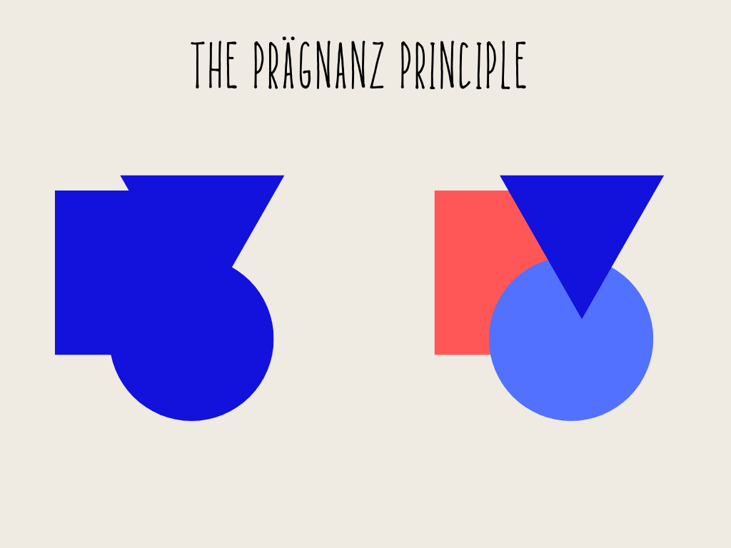
We tend to see the three distinct forms rather than the complex object in blue colour. It is a simpler, more straightforward good figure.
Let’s walk a little more on this essential law, the Prägnanz Principle, so essential for UX design.
Incorporating the Law of Prägnanz into UX design can greatly enhance the user experience. By following these practical application tips, you can create visually appealing designs that are easy for users to understand.
- Choose simple shapes:
According to the Gestalt law, people find it easier to remember and interpret shapes that require less cognitive effort. For example, users will find a square easier to recall compared to an abstract figure.
- Embrace simplicity:
Our brains naturally gravitate towards designs that are not overloaded with information. Reflecting this quality in your designs is essential for providing users with an intuitive and satisfying experience. Consider incorporating features or tools that make tasks more efficient and enjoyable for users.
- Conciseness in wireframing
Conciseness is a valuable principle to consider when creating wireframes. Since our eyes combine the elements into one coherent page, making the shapes and forms easily understandable for the brain is important, which constantly tries to minimise cognitive load. Essentially, we should design layouts that can be perceived at a glance.
Ensure that all necessary elements are visible before adding any unnecessary details. I suggest using conciseness to prioritise design essentials such as clear navigation, calls to action, page titles, etc. It will help your users to comprehend the structure and categories of your product or service from the start.
By applying these principles of simplicity in your UX design, you can create products that offer maximum usability and leave a lasting positive impression on your users.
The Prägnanz Principle in Art Form
When it comes to the world of art, the Prägnanz Principle is a powerful tool that artists can utilise to create captivating illusions in their work. By understanding and incorporating this principle, artists have the ability to emphasise specific elements within their designs.
A perfect illustration of this concept can be found in the mesmerising artwork of Salvador Dali. Known for his surrealist style, Dali skillfully employed the Prägnanz Principle to bewilder our minds and challenge our perceptions. A prime example of this can be seen in one of his paintings showcased on Tavis Glover‘s remarkable website. In this particular piece, Dali masterfully manipulates our visual perception with an illusionary depiction of both a dog and a face. Prepare yourself for an intriguing experience as you gaze upon this painting and witness how your interpretation unfolds before your very eyes.

Upon initial observation, our mind recognises the presence of both the face and the dog in the artwork. But upon closer examination, one can discern the individual components that form each object. This illustrates the fundamental principle of Prägnanz and other principles of Gestalt psychology – our perception tends to prioritise perceiving the entire image before focusing on its individual elements.
Unity & Congruity
When designing with the Principle of Prägnanz in mind, the goal is to create a cohesive and harmonious composition. Each element within the design should harmoniously work together and have a clear purpose that visually connects them. Gestalt Theory in education and educational software has proven effective in conveying meaning and messages. These principles are characterised by simplicity, repetition, and clarity, making them ideal for instructing and establishing knowledge.
Over the last few decades, frequent user evaluations have indicated the benefits of utilising all the identified Gestalt Laws in visual screen design and enhancing learning effectiveness. Two-dimensional graphic designs such as graphics, posters, and magazine layouts can greatly benefit from incorporating the visual principles of Gestalt Theory. Doing so can improve composition, enhance visual communication, and consolidate information.
However, there is still so much more potential to be explored in this field. We are merely scratching the surface of what could become a solid foundation for UI/UX design—a future brimming with beautiful possibilities. Continued improvement will enable us to analyse and expand upon user experience through more persuasive compositions that effectively convey messages and facilitate communication.
The laws of Gestalt Theory for computer screen design
Virtual Reality (VR)
Understanding how humans perceive visual information is crucial in creating engaging and relatable websites and images. Immersion has become increasingly important for enhancing task performance and user comprehension. Efficient perception and processing of inputs greatly impact the overall user experience.
Gestalt Theory principles serve as valuable guidelines for developing VR applications, particularly in education and instructional software. These principles offer psychological insights into human perception, specifically regarding pattern recognition and subconscious object grouping. They are widely utilised in user interface design to determine the appropriate size, shape, position, and colour choices.
Mental Workload
The multifaceted idea of Mental Workload is amenable to the principles of Gestalt theory as well. According to William MacNamara’s (2016), a research scientist, “mental workload is defined in terms of time, distance to the desired goal, and effort.” Usability, as we can deduce, is affected by the level of stress that users feel when using the software they are required to use.
Using the Gestalt Principles, a designer can foresee the strain a product will place on a user and make adjustments to reduce anxiety. There’s a big chance to improve the website’s user-friendliness immediately. Involving users’ brains in the World Wide Web’s design process aids designers and others working to make websites more user-friendly in every way.
The website should present a challenge without exceeding its visitors’ capabilities while being engaging and easy to use.
Software Usability
The International Organisation for Standardisation (ISO) defines usability as “the extent to which specified users can use a product to achieve specified goals with effectiveness, efficiency, and satisfaction in a specified context of use.”
Usability is no longer viewed as a luxury item. It’s a given that all successful websites will contain this feature. UX/UI designers focus on enhancing the user’s experience by providing tools that make the website easier to use.
How is Gestalt used in design?
The design of the user’s interaction with a product or service is a dynamic, interdisciplinary field. Principles from anthropology, HCI (human-computer interaction), engineering, and other disciplines inform its design.
Incorporating Gestalt rules into your design is simple and may transform your work from chaotic and competing for the user’s attention to one that feels natural and intuitive and leads them naturally to the outcome you desire.
Using the principle of Prägnanz, we tend to simplify ambiguous or complex images into their most basic forms, as this requires the least amount of mental work.
Applying the Gestalt Theory to web and graphic design

Look at the image above. It depicts a Dalmatian dog investigating the ground within a forested area. When you see a dog, you do not recognise him by his individual elements; rather, you perceive him as a whole, all at once.
Visitors do not recognise individual sections of the websites we design; rather, they recognise the entire website. We view things holistically, not as the sum of their elements. According to psychologist Kurt Koffka, “the whole is different from the sum of its parts.” Perception effort is underpinned by perceptual organisation. Our minds desire to exert the least amount of effort feasible.
If you ask several acquaintances to draw the Sydney Opera House, they will all produce the same outline. They will not depict each individual component because we first see the whole.
In bold letters: “An element’s overall appearance must always take precedence over its particulars.” We must design a user interface that does not require excessive cognitive exertion from the user.
What are computer screen designs, and how do they interact with Gestalt Theory?
Four questions must be answered to determine what computer screen designs imply.
- Where am I?
- Who is here with me?
- What am I doing here?
- How can I move forward?
We instinctively glance around after entering a new screen to determine our location—numerous hints aid in answering this query. When designing computer screens, designers must answer those questions to help the visitors identify where they are, set their goals and move forward.
The principles of Gestalt theory contribute to the interface design. They perpetually educate visitors by assisting them to see the screen and comprehend its meaning. The designer is responsible for managing associated concerns and encouraging visitors to understand.
Simple and clear screen designs
Humans, according to the law of Prägnanz, prefer straightforward and logical inputs and experiences. In addition, when confronted with complexity, our minds tend to oversimplify the situation. This means that screen designers must bring order to chaos to facilitate the understanding of their screen designs.
Users prefer simple, straightforward interfaces. Such interfaces are intuitive, simple, and pleasant, so users look forward to repeatedly opening them. However, achieving such clarity in interface design is challenging. When working on a design project, it’s important to keep the interface’s logical hierarchy intact by having fresh ideas and information surface one after the other.
This means designers must provide significance to the things they show and help viewers draw associations between them. One such example is the iconic photo of the Olympic rings. While they are merely a collection of semicircles and other unfinished shapes when viewed at face value, our brains interpret them as interlocking rings that symbolise healthy rivalry.

Tips to apply the law of Prägnanz to computer screen designs
When it comes to incorporating the law of Prägnanz into computer screen designs, oversimplifying may seem like the easiest option. However, this approach can be limiting in terms of the amount and variety of information that can be included in your reports, infographics, presentations, and other business communications.
Instead, here are some practical tips for effectively applying the law of Prägnanz to enhance your online business communications:
Build a distinct visual hierarchy
Establishing a distinct visual hierarchy is vital for effective design. Employing diverse techniques such as size, colour, alignment, shape, patterns, and spacing helps guide the viewer’s attention to the most crucial aspect of each page or frame. Additionally, organising elements in a manner that clearly communicates the intended sequence of information consumption is essential.
Strike a balance
Symmetry is one of the core Gestalt principles, but this does not imply that everything must be on the same scale or perfectly balanced. The law of Pragnanz states that individuals prefer simplicity and order, not boredom! Consequently, applying subtle alterations to suggest motion can also satisfy the need for outstanding Gestalt.
I am not saying that you must make everything appear identical to achieve equilibrium. Rather, employ a technique in which the eye moves from side to side. The end result is a naturally appealing and visually engaging composition.
Summing it up
Good design = good human psychology = good accessibility
The experience you create for your product through the design of its computer interface should prioritise human psychology. The unique Gestalt will pave the way for experience delivery.
The understanding law of Pragnanz helps you achieve product cohesion and visitor accessibility. The arbitrary arrangement of elements is eliminated by a cohesive user interface. Using the other Gestalt laws (similarity, proximity, continuity, closure, and common fate), it is possible to design a computer interface by producing a whole that is greater than the sum of its parts. This will help establish connections between the desired user experience and the user’s psychology.
F.A.Q.
Gestalt psychologists' central claim regarding the perception of the visual field is that humans perceive various stimuli as an organised "whole" with a distinct form. According to them, the form of an object resides in its entirety, distinct from its individual elements.
Gestalt in UI UX refers to a set of principles that guide our understanding of how the human mind perceives visual stimuli. Max Wertheimer, Wolfgang Köhler, and Kurt Koffka laid the foundation for Gestalt psychology by highlighting the importance of perceiving patterns or configurations as a whole rather than individual components.
The principles of Gestalt shed light on how humans organise their perceptions and how they attribute meaning to those perceptions based on their existing knowledge and past experiences.
Essentially, Gestalt teaches us that we derive meaning from our interactions with the external world. It reveals how we make sense of complex elements and engage our memories to reason or comprehend the impact of experiences.
Ultimately, our perception and construction of meaning are deeply intertwined with our identity and willingness to explore.
It's fascinating that billions of people from all walks of life and every corner of the globe share similar psychological tendencies when it comes to their visual impressions, despite their vast differences in culture, geography, identity, and philosophy.
The principles of Gestalt theory can help us train our visual perception to recognise what contributes to and what detracts from our intended message. Alignment, hierarchy, contrast, repetition, balance, colour palette, readability, positive and negative spaces, and so on are all adhered to, as are many other tried-and-true design principles. However, it provides a scientific justification for the mind's inherent biases and the viewpoints it employs while making decisions. The field of online and graphic design is one where the Gestalt Theory will naturally develop into a significant player. With a refreshed understanding of Gestalt Theory, we designers can create the most engaging and effective web and app pages, ensuring that our users see exactly what we want them to.
Read also:
- Principle of Proximity in the Gestalt Theory
- Principles of the Gestalt Theory to Create Incredible Graphics
- Principle of Similarity in the Gestalt Theory
- Principle of Symmetry in the Gestalt Theory
- Gestalt Theory: How Our Minds React to What We See
- The Principle of Relationship in Gestalt Theory
- What does the Law of Proximity mean in UX design, and why does it matter
Editor’s Note: This post was originally published in April 2020 and has been completely revamped and updated for accuracy and comprehensiveness.
Are you ready to create Something Spectacular?
Here, at Moss51 Art & Design, we specialise in SEO content writing for your business website or blogs. Your blogs and website pages need to look nice with well-written content to attract customers and search engines. Let’s talk.
We specialise in writing trustworthy website content for web pages and blogs.
I hope you enjoyed reading this article. Did you find the information on this post useful? Leave your comments below.
Print and share this article friendly; you are free to use and reproduce it, just please attribute Moss51 Art & Design as the original author, and link back to this post!